i’m in the middle of reading the third and final of the Stieg Larsson Millennium trilogy, The Girl Who Kicked the Hornet’s Nest. (while i’m thinking about it, shouldn’t it hornets’? i mean, don’t they live in colonies together? so the nest wouldn’t belong to just one hornet. Joe the Hornet. John Q. Hornet. i dunno, something seems off.)
i’m not even close to finishing it yet, but so far i can tell you that it is JUST AS tedious as the first two. There are half a million characters to keep straight and the amount of details is never-ending. i’m not saying it’s a bad thing, okay? i’m just warning you that if you think this is a “summer read” or a “beach book” just something you can sit and chill and mindlessly read, it’s not. you better have your thinking cap on.
this one starts up right where the second one, The Girl Who Played With Fire, left off. which is nice that it didn’t skip ahead or gloss over events. however **** TGWPWF SPOILER ALERT**** that ending was so bullshit stupid that i felt it ruined the whole book. i’m sorry, but when you’re shot three times, one of the shots being IN YOUR HEAD, and then you are BURIED, i don’t think you get to dig yourself out of your grave and EXACT AXE-WIELDING JUSTICE on your “killer”.
call me old fashioned.
did i want Salander to die? of course not. she’s the only reason Americans are reading these books. (please tell me you knew that. tell me you didn’t think we were picking up on the “injustice to women” subtext? you know us better than that. however, if you want to write a feminst book to make a point, i don’t think you should have the other main character be a middle-aged man that the “The Girl Who” falls in love with.) i’m rooting for Salander just like you are, BUT that doesn’t mean i’ll tolerate bullshit for the sake of bullshit. getting shot in the head, buried in the ground, and then digging yourself out of the grave and axing-to-the-head your tormentor is a complete crap plot point. in any country.
and the reason i hate that so much is because the books are good. it’s that one part that makes it so stupid. so i have decided to believe that since Mr. Larsson died before his books were published that maybe he would have gone back over them with an editor and been all, “hey, you know the part where Lisabeth gets shot in the head?”
“yeah, then buried?”
“right, then buried. then she doesn’t die, remember? she digs her way out of the grave.”
“yeah, despite the multiple gunshot wounds, one of which was a headshot.”
“yeah, and one to the shoulder.”
“probably making it difficult to dig her way out of the grave.”
“probably.”
“tough girl.”
“yeah. then the axe part, right?”
“the axe! i forgot about the axe.”
“that’s all plausible, right?”
“what do you mean?”
“i mean, people will buy that, yeah?”
“oh yeah. well, i mean, Americans will.”
“should i… change any of that?”
“mmmm, yeah. in fact, change that whole bit. it’s crap.”
“it IS crap, isn’t it?”
or something like that.
anyway. we’ll see how Hornet’s Nest goes. maybe aliens will show up?
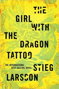
one other thing i’ll say about this series is that i do like the book covers. i have no idea what the Scandi/Euro covers look like. i’m just glad that the covers don’t have trees on them. it seems like most of the Scandi crime books have trees on the cover. (not to say that we don’t ever put trees on our book covers, but it was just something i’ve noticed.)
i’ve enjoyed the odd palette.

see? weird colors. simple type (which is great), and the tattoo kind of covers some of the letters? love it.

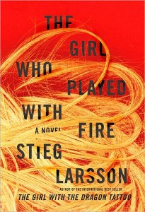
this one was far more garish with the colors. it almost hurts to look at this one. again with the simple letter style and the hair overlaps the letters. see? with the unity? i didn’t like how the words were placed on this one as much as i liked the first one, but that’s just me. also, the hair? really has nothing to do with The Girl. i guess it could be her wig? doesn’t matter, there’s no fire playing in the book either.

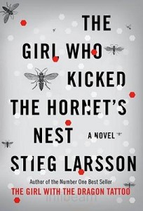
i liked this one as well, but what you can’t tell from the picture is that the background is a chrome silver. it’s shiny. unfortunately i think that gives it a bit of a sci-fi look to it. i wish they had chosen a real color instead. but the design is still good. i really like the title layout (compared to the others i think this one is the best). the dotty hexagons overlap the letters (unity! important!) but the hornets, lack an imagination, i think. most of them are the same picture (just smaller?) and most are facing the same direction. to me they look like WWII bomber planes in the air. i’ve not finished reading the book, but i’m doubting that WWII bomber planes make an appearance. if, by some chance they do? kudos to the graphic artist.
it reminds me kind of like something my pal Laura would do. not the colors or the bland hornets, mind. but with the layout. it’s a more sparse design than the other two covers. i dunno. maybe not. Laura, how would you have designed that?
****
anyway, i need to get back to reading this so i can read all the other books i so want to read right now!
Tags: laura, Scandinavian crime fiction, Stieg Larsson
No Comments


